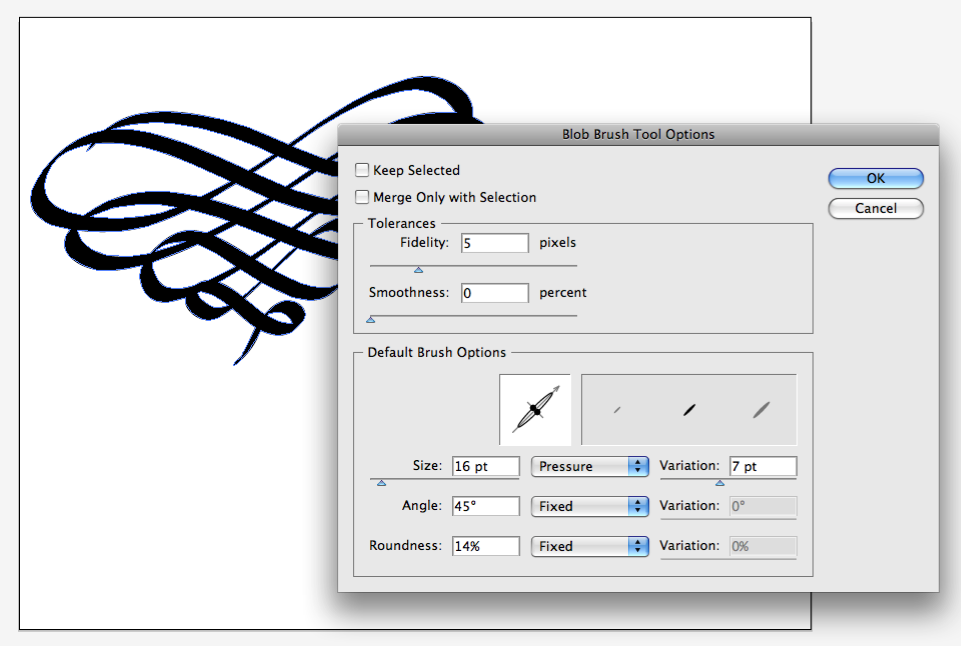
Using a Wacom Bamboo Pen & Touch graphics tablet and Illustrator, I tweaked the blob brush to something similar to a chisel tipped pen. Changing the size variation (set to pressure sensitivity) gives the ink flow a different feel – sort of like a softer or harder nib.
After you’ve drawn/written something you can fine tune the lines by altering the paths – adding, deleting or moving anchor points at will – but I like to leave things as is, making it more personal.
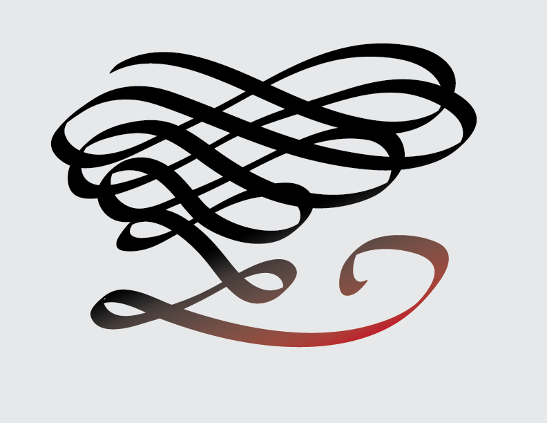
I played around with digital lettering, flourishes and the likes for quite sometime,
then came across a website that generates graph & writing paper: Incometech
which was useful for practice lettering.
One nice thing about digital calligraphy is that you can delete it and start over as often as you like, or just delete one offending letter or squiggle (I still prefer real ink on paper, just saying). After a long time of writing, deleting, and just messing around eventually I ended up with this.
 |

I love those pens. Great for making cool designs too. I always liked the spacing in your handwriting. It's a weird thing to notice, but I m kind of a hand writing freak.
LikeLike
Thanks! Nice to know there are other handwriting freaks out there.
LikeLike